WEARABLE ART: THE PHOTOSHOOT
Fashion photography was my favourite activity of this course since this is something I enjoy doing in my spare time.
To shoot my final wearable piece, I wanted it to be in a natural surroundings that incorporated nature and natural elements.
Takato Yamamoto is a Japanese artist and therefore uses characters in his art with a Japanese heritage, the image these characters have is young and innocent with untouched beauty. The reason I love his work is because he mixes this with gore and horror aspects which creates an interesting contrast. My way of portraying this concept is to wrap the model, me (mostly because I am Japanese and could portray the intended body language I wanted), in bandages to signify injury and bondage in being restricted. Rope was also a prop I bought to imitate the idea of being tied up and helpless. I also incorporated rose petals to add more delicate properties to the image but it would be better if I added real petals and real large flowers.
LOCATION SHOOT
For my location shoot, I wanted it to look like a magazine for grunge type fashion. Fashion brands I gravitate towards would be Dolls Kill and Killstar all of which add elements of dark femininity and gutsy designs. I mainly focused on the editing and location in the photos, I wanted a natural background since it would look more effective than an edited one but I did edit in small details and pieces to present the styling of my choice. Ideally, real props and accessories would be better since it would look more realistic and less time could be spent on editing and more focus on photography.
Before the shoot, we had to put ourselves in the role of a creative director (something I love the idea of apart from that I don't like bossing people about with my ideas but that is a learning curve if I want to clearly communicate my visions).
A design board was created to give a sense of what this shoot would communicate to its intended customer. I used photoshop and secondary images to create an image of the desired vibe I wanted to portray.
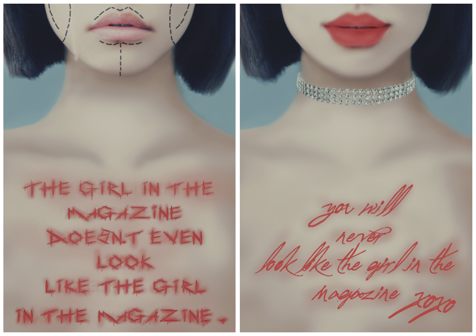
Experimenting with magazine style fashion layouts~
To shoot my final wearable piece, I wanted it to be in a natural surroundings that incorporated nature and natural elements.
Takato Yamamoto is a Japanese artist and therefore uses characters in his art with a Japanese heritage, the image these characters have is young and innocent with untouched beauty. The reason I love his work is because he mixes this with gore and horror aspects which creates an interesting contrast. My way of portraying this concept is to wrap the model, me (mostly because I am Japanese and could portray the intended body language I wanted), in bandages to signify injury and bondage in being restricted. Rope was also a prop I bought to imitate the idea of being tied up and helpless. I also incorporated rose petals to add more delicate properties to the image but it would be better if I added real petals and real large flowers.
LOCATION SHOOT
For my location shoot, I wanted it to look like a magazine for grunge type fashion. Fashion brands I gravitate towards would be Dolls Kill and Killstar all of which add elements of dark femininity and gutsy designs. I mainly focused on the editing and location in the photos, I wanted a natural background since it would look more effective than an edited one but I did edit in small details and pieces to present the styling of my choice. Ideally, real props and accessories would be better since it would look more realistic and less time could be spent on editing and more focus on photography.
Before the shoot, we had to put ourselves in the role of a creative director (something I love the idea of apart from that I don't like bossing people about with my ideas but that is a learning curve if I want to clearly communicate my visions).
A design board was created to give a sense of what this shoot would communicate to its intended customer. I used photoshop and secondary images to create an image of the desired vibe I wanted to portray.
I used the Japanese actress Kiko Mizuhara as my model in this design board and edited in tree branches, rope and roses with leaves. I wanted to make it look natural and realistic as possible since the art style of my chosen artist promotes authenticity. I liked how the original photo of the model was naked since it adds vulnerability and her face looks pure and innocent. I made the rope be tied around her neck to look tied down and powerless but the roses balance the look with its rich colours. I also added slight scratches and blood marks to her to add a hint of gore but I made sure that the opacity was high since I didn't want it to look too much or harsh.
THE FINAL SHOOT
I was the model for the shoot but I also directed how I wanted the photography look, I sat in front of a hedge full of leaves and wrapped my chest in bandages while rose petals were scattered across my body. This photo involved heavy editing since it was a bright sunny day and a big ol' construction crane was peeping out from behind the bush ruining my picture...
Darkening the image automatically set the mood of the piece since it looks more mysterious and almost dangerous since you cant see what could be lurking in the shadows. I like how the hints of red from the petals pop but next time it would be better to get an angle that reveals more of the wearable piece since that is after all what is meant to be showcased most.
Experimenting with magazine style fashion layouts~


Comments
Post a Comment