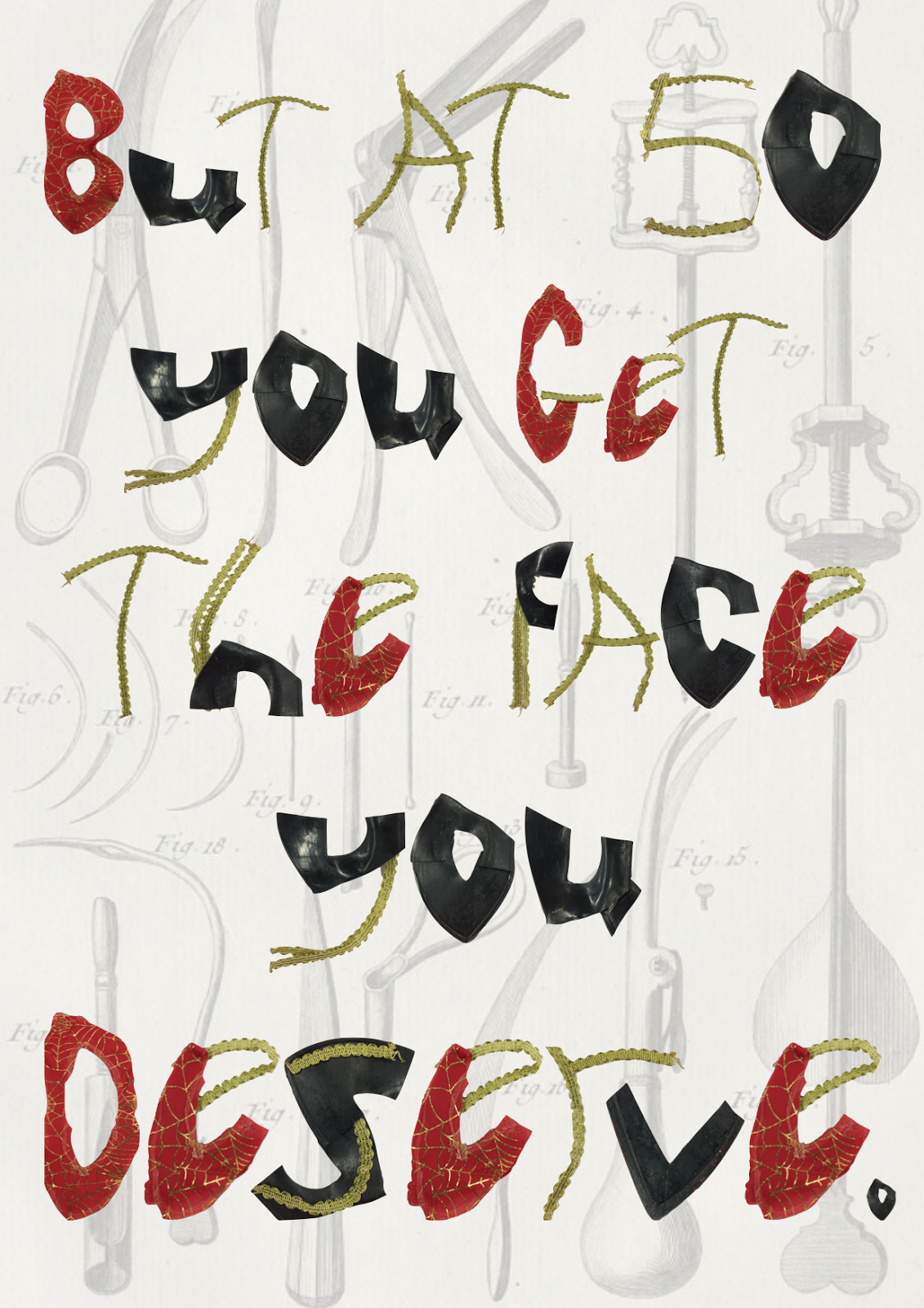
GRAPHICS: OBJECT LETTER COLLAGE
"Nature gives you the face you have at 20. Life shapes the face you have at 30. But at 50 you get the face you deserve." - Coco Chanel
The quote was said by Coco Chanel (written above) meaning that nature will give you your natural and youthful appearance in your 20s made up of little experience in the grand scheme of things. You are naive and have yet to experience the world.
Life shapes the face you have at 30, interpreting this that you will experience some of the biggest things in your twenties since you are finding yourself in society, a path of exploration. By your 30s you are more experienced and your decisions have shaped you into the person you have become.
But at 50 you get the face you deserve. People usually take the idea that at face value, your experiences, become noticeable visually by this age. e.g. a rough appearance may indicate a life of hardship in some way. However, this could be a controversial idea since I think that people in social media have completely warped what reality is.
Celebrities in particular use surgery to drastically change their appearance whether this be lip injections, nose jobs or breast enhancements. More often than not people deny going under the knife which makes it worse for young people growing up thinking that what they see on social media is natural and think its attainable.
The mask is a representation of false appearances, covering up surgery and making others believe what they have is real when in reality its the opposite. Young people shouldn't have to feel like they need to accommodate to unattainable and unnatural beauty standards.
Different typefaces can alter the meaning of the words used. The aim is to alter the font type to portray the message that we want to get across.
The mask was cut, pulled apart and distorted to create the alphabet. I pulled off the gold embellishments and fabric so I was left with the plain plastic mask (it helped the mask was cheap from poundland because the parts were easy to pull off, low quality was favourable for this project).
The gold in the alphabet was the ribbon, the red was the mask fabric and the black is the plastic of the mask. Since I wanted to leave the pieces as natural as possible without too much manipulation of materials to create the letters, the forms are abstract and rough. I like the look of this since it suits the message in that there is no perfect beauty. At first the letters looked unreadable but when put together it is easily distinguishable.
I then used the mask alphabet letters to write out the quote. I broke it down into three posters since each sentence looked more powerful on their own. To suit the message of the motto, I edited an illustration poster in the background of surgical equipment to describe what young people are doing to themselves to attain unrealistic social media beauty standards.


Comments
Post a Comment