GRAPHICS: FINAL POSTER
"You will never look like the girl in the magazine, the girl in the magazine doesn't even look like the girl in the magazine"
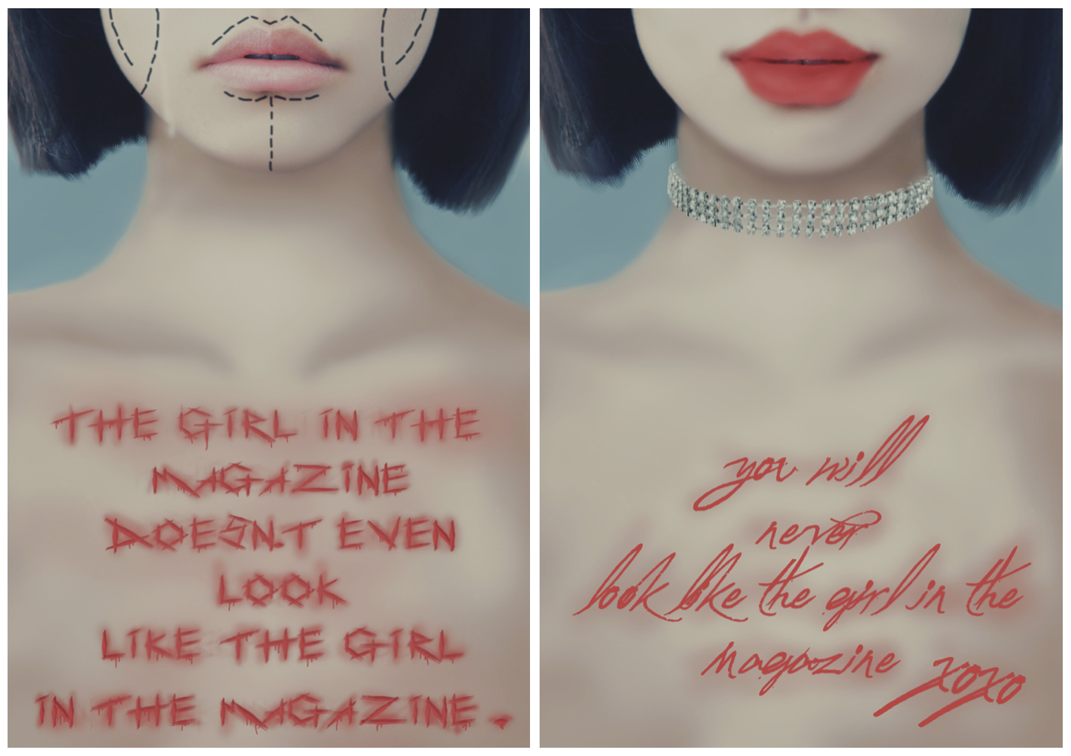
For the final poster, I decided to choose a different quote than the previous Coco Channel quote. I felt that a more powerful and graphic message could be communicated in poster form through this saying since it is a topic discussed predominantly in today's society and also something I feel strongly about.I think this outcome was successful since I feel the typography is fitting and communicates the message. This poster does however rely on imagery along with typography yet typography should be the main focus point to portray the message and feel of the poster. The way the poster was finalised doesn't just rely on imagery since an image was not just simply used with a plain text on top, this merged the two to create a visually powerful message. This would also be effective if shown globally since imagery is easier to understand than text since one language is not universally known.
Type as Image can refer to using type to portray an image of a message, the font and the way its written should speak the message of the poster. A campaign is a movement to raise awareness of a certain issue, this campaign is to promote that people on social media and in magazines are not really as they appear. Photoshop and plastic surgery are brought into the equation yet young people don't always know this and think they need to attain what they think is this natural beauty they see everyday. I belive this poster successfully captures this message since the font and the image merged show the feel of the posters.
A pair of posters was created for a series, the first in the series being "You will never look like the girl in the magazine." I added XOXO at the end to give an impression that this poster was superficial and down putting to others saying you will never attain the 'natural' beauty these models have in the magazine, the xoxo is a patronising sign off aimed at the reader. The font style is very italic and flowing and aims to imitate lipstick as if the model has written it across her chest in red lipstick which emulates glamour, especially when paired with the red lips and diamond choker.
The second poster in the series aims to contradict the first poster, the same girl is used but with a bare face and drooped smile. There are plastic surgery line markings on her face to signify going under the knife in order to look like how she does in the magazine (when compared the lip sizes are significantly different in the first poster to give the idea she has had lip injections, a common beauty trend today). The typography for this poster is scratchy and harsh, the image portrayed is a surgical knife has carved the words into her chest to link with surgery and the pain of permanently being scarred by surgery and maintaining beauty standards. To make it look engraved I added red blotches and red blood dripping to hint its a part f here body. The font is dramatic and when paired with the image is very graphic and clearly gives negative connotations in contrast to the first poster.
The mot difficult part of this project was editing the image and making the font look realistic. I had to draw the body and match it to the skin tone of the face. It was also difficult to make the scratched font look like it was engraved into her chest, this was done by using low opacity brushes in photoshop to make it look raised and blotchy around her skin. Next time I think I would rely more on my own photography (i.e. modelling a picture of a girl with a bare chest for me to then edit on since this cut out a lot of time in the design process).
I think the layout successfully suits the message of the poster, I purposefully left out the rest of the face since eyes can give away personality and the point intended was that magazine and social media girls are usually referred to as copy and paste girls so I wanted to give few features of the face away to give a sense of anonymity. The typography matches each poster since the flowy and italic writing is carefree and feminine, whereas the scratched font looks harmful and uncomfortable.
I gathered inspiration from a music video by Melanie Martinez called "Mrs Potato Head." Some of the most inspiring lyrics include
"is it true that pain is beauty"
"they stick pins in you like a vegetable"
"no one will loved you if you're unattractive"
"if you weren't born with it, you can buy a couple ornaments. Just be sure to read the warning kids cause pretty soon you'll be bored with it"
"Don't be dramatic its only some plastic"
The lyrics talk of beauty standards and young girls thinking they need surgery to look and feel beautiful.
INSPIRATION
One graphic design artist that inspired this poster was Stefan Sagmesiter, his work inspired the ideas of moulding and portraying fonts on the body and face. The first image is photoshopped using graphic imagery to make the font appear part of his body yet the second is face painted.
Neville Brody is an English graphic designer, typographer and art director. His magazine front covers inspired the styling of my poster; a close up with a main person/ figure and typography.


Comments
Post a Comment